Intaglio

OK..So I realized that I should re- visit printmaking.
I really enjoyed and explored litho, etching and mono-printing in college, but the requirement of a press has kept me from the medium for 20 (or so) years.
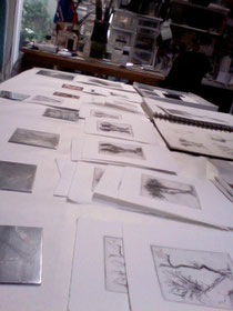
I signed up for an intaglio class with a former colleague and have been busy ever since. Intaglio is a process of printmaking where one draws on a metal plate and in such a way that the line becomes a groove into which ink can be rubbed and then pressed onto (into?) a piece of paper (like the way dollars are printed.) This can be done by etching (using an acid bath) or engraving/drypoint (where the lines are scratched or carved into the plate.)
We started with linoleum printing, which is a little different because it is a relief print, meaning the ink sits on top of the plate (as oppose to within the carved lines.) Both processes have required me to think in different ways that have led to exciting outcomes.
The lino-cuts led me to make these super graphic, Kline-eque images, while the intaglio has supported the meticulous crosshatch line drawing qualities. Altho the lino-cuts have produced work I would like to explore, I feel the need to focus on the intaglio prints since those require the special press to process.
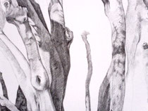
I am working on a series of olive tree images which I find both touching and humorous. In La Mirada (where I live) many (most?) homes have an olive tree. I have become interested in the variety of ways homeowners deal with this beautiful, but messy, tree. Some people let the tree become overgrown, but many do their best to shape the tree into what they believe is a pleasing, controllable shape, with mixed results.
The shape of the olive tree is a direct reflection of its owner. The history of its prunes, clippings and shapings say as much about it's look as its DNA (the old nature/nurture conundrum.) This has given me an infinite supply of source material while I re-learn and explore the incredibly beautiful medium of intaglio.
Olive Tree

One of the last drawings I did for the Dialogue Squared show was a small ink drawing of the olive tree in our front yard. The drawing was about 7 inches square and I did it in one evening with a 005 micron on Bristol. That drawing got a lot of attention and seemed to do something more than simply represent the tree, it had something extra...but I can't figure out what it is.
The effort to understand what makes one drawing better than another (illusionism aside)is the eternal question I guess. In an effort to understand I decided to re-draw the olive tree but on a larger scale to see if it would yeild similar results. The desire to recreate the intensity of a small artwork on a larger scale is an old idea (Franz Klien, anyone?)but I gave it a shot: Same tree, same lighting, same materials...different size.
I have been playing with scale a lot in the past few years. The xeroxes that I've been making for the xerox transfers effectively enlarge the size of the drawing and the mark together, so this time I kept the mark the same size as on the small drawing (005) and just used larger paper (21").
Another difference between the olive tree and the flowers and leaves that I have been focusing on in the cross-hatch drawings is the use of negative space, which also implies depth and deeper space. The flat geometric shapes that I have added to some of the drawings definately add some depth by reaffirming the picture plane, but the negative shapes add depth by adding space... by implying air.
Still don't know what the hell I'm doing. In an effort to understand I created a stop action movie chronicling the development the the larger version of the olive tree, and am now drawing more trees.
Botanical

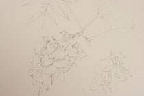
The Wisteria is blooming late this year (I think I confused it by pruning it at weird times.) It's such a complicated flower...but great to draw...such a combination of symmetrical order and chaos.
I went to see the Los Angeles Biennial (the portion that is at the Hammer Museum) an impressive collection of LA contemporary artists that runs across the spectrum (old/young, figurative/abstract, sculpture/painting/video. ) It's a great show.
I fell in love with the work of Channa Horowitz. She has been making these intricate drawings based on the grid format for forty years. I have always been drawn to artists that embody an obsessive quality...you believe that they would be making their work and it would look basically the same no matter what their life's circumstances were.
Channa's work uses the rigidity of the grid and what looks like detailed mathematical systems to create her stunningly beautiful drawings that have a feeling of controlled chaos.
I guess that's it: controlled chaos....beautiful controlled chaos.
Kelly Thomas Drawings

Here are some "in-progress" drawings of Kelly Thomas, the homeless man who was beaten to death last year by Fullerton PD.
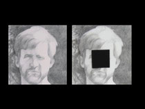
I wanted to do a straightforward silverpoint portrait of Kelly for the Fullerton art show (Justice 4 Kelly @ PAS Gallery).....something nostalgic, reminiscent of earlier times in his troubled life. I used a picture I found on the internet, I liked the overexposed boyish quality of the blurry picture. It took a few tries before I drew something that felt close.
But, does a straightforward portrait say enough? The silverpoint lends a softness and it will tarnish over the years...evolving and changing. It's intimate, small, almost snapshot sized.
I decided to take it a step further down the content road....borrowing an element from some of my recent paintings by blotting out what could be considered the most important part of the image. A black square placed in the center of the square image: symmetrical, cubed, sterile.
The humor I felt when naming one of my paintings "Anonymous Succulent" in reference to the black shape they use to cover the eyes in photos (to preserve the subjects' identity) took on a pretty dramatic effect. Kelly was unrecognizable when brought to the hospital...he is taking on an "everyman" quality with regards to mental illness and homelessness. His personal identity....his personality...his individuality is slowly dissolving.
Formally, I love the way the black square establishes the picture plane and inherently pushes Kelly back away from the viewer adding to the nostalgia/memory quality.
Personally, I'm finding it difficult to paint the black square over his face...I worked hard cross-hatching the subtleties of his likeness! (right now it's just a black piece of paper taped to the drawing.)
So do I "wimp out" and do a diptych (one of each?) Not sure.
